.png)
Overview
This summer, I started my internship as a UI UX Designer in Oigetit Fake News Filter. Oigetit Fake News Filter is one of the world-leading news companies that rate news based on reliability. During my internship, I design the company's app store screenshot, onboarding page, style guide, search page in mobile and website, and company's mascot, etc.
App Store & Play Store Screenshot
Original Version
-
simple yet lack of eye catching heading and design

.png)
My Initial Redesign
-
three different colors from light, medium and dark blue
-
Tinted pink and purple wave to make the design pop to the audience
-
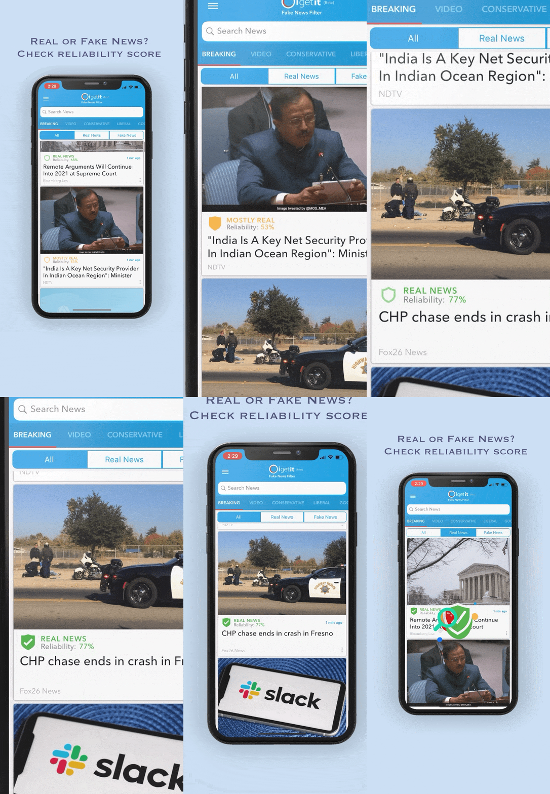
Add more features to demonstrate the full function of the app
.png)
.png)


Final Design
-
After a discussion with the marketing team and CEO, we decide to go with the medium blue color
-
Add more catchy lines to the design for a marketing perspective
-
Used iPhone mockup for IOS App store and Google Pixel mockup for Google Play store
.png)
.png)
*My design is now live on App store and Play store, view by millions of users everyday.


Customization Page
Original Design
-
simple and intuitive but is not enough aesthetically appealing


My Initial Design
-
Stay consistant with light blue and purple theme
-
One design with check when cliked and one design just have blue surrounded ring


Final Design
-
combined intial design 1 and 2 for more intuitive design


Styleguide
-
created styleguide for company to help designers and engineers have easier acess to all the design element
-
help design to stay more consistent


*images blurred for confidentiality
Search Page Mobile
Original Design
-
Simple
-
Research result only have text and no graphic


First Iterations
-
Display different categories to choose from
-
Offer trending search to encourage users to read more news
-
Recent for search history
-
Show the original news screen as users typing to search


Second Iterations
-
Remove Categories
-
Move Search History to the top
-
Trending News instead of trending topic


First Iteration of Search Result Page
-
Display result with images and reliability source
-
Can add the news to Favorite easily by tapping the star
-
Sort by function allows user to search the news more precisely


Second Iteration of Search Result Page
-
Dropdown categories menu
-
Dropdown Reliability Score menu


Website Article Page
Original Design
-
When click "Read more" it takes user to its original news website, instead of staying at Oigetit
-
Didn't display the full article

My Initial Design
-
Display different categories on the top or side
-
Easy way to share the article or save to Favorite
-
Full articles with the source and Reliability Score
-
Most popular articles on the side


Onboarding Page
Original Design
-
Not much graphic
-
Not visual attracting
-
Didn't show users how to use the app


My Initial Design
-
More illustration to attract users
-
Display different features of the app


Company Mascot
My Initial Design
-
Ninja Robot - represent company's fast AI technology
-
Shield - show the unique reliability score feature in the app
-
Round shape reflects company's "O" logo
-
Ring around the robot shows the speed and reflects company's logo


